XXIII
Subway
Research /
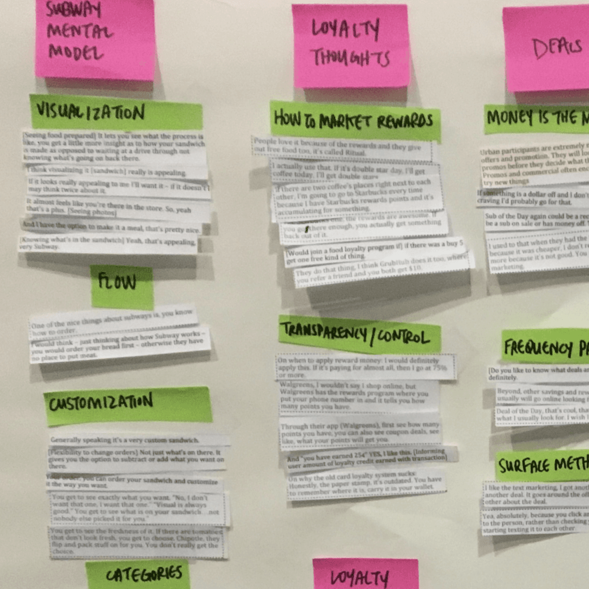
Our first step was to better understand the user. To do this the team conducted a national segment survey as well as in-person, in-restaurant customer interviews. We tested an early prototype and had in person discussions with customers about their purchasing behaviors and what they liked and disliked about the current Subway experience.
Equipped with a deeper knowledge of the user and the current problems facing Subway’s digital experience, we established design pillars that the team would use as guides for the entirety of the project:
Wireframes /
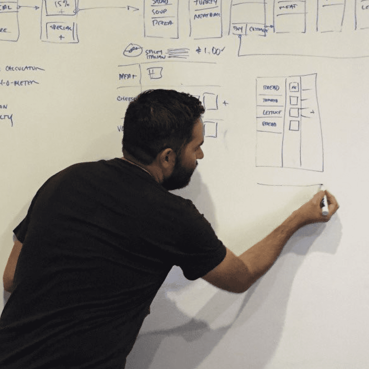
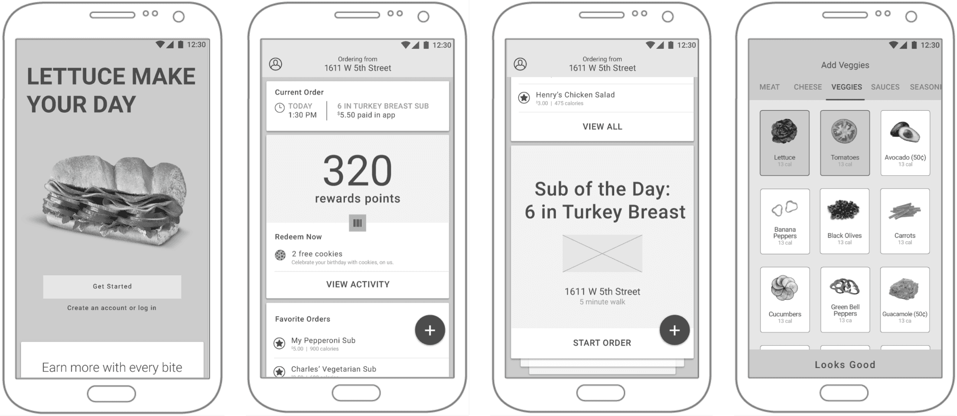
Using the design pillars and knowledge of Subway and their customers, the UX team began the wireframing process. Throughout this stage the team would gather in our war room (coined the “Bread Box” mainly due to the lack of ventilation) where the team would whiteboard screens, flows, interactions and many sandwich sketches. Collaboration was key to the project's success, especially in the early stages where the foundation of the application was being established.
Visual design /
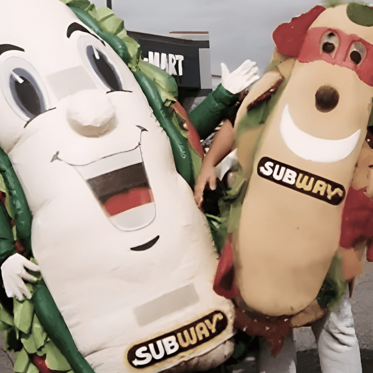
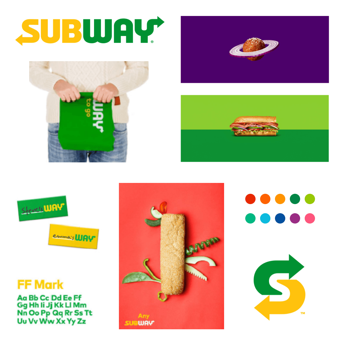
Weeks into the visual design process, after initial development effort had started, the team was informed that Subway was actively going through a rebrand. Unable to gain access to final brand assets, we had to pivot to a more generic direction that could adapt to the incoming brand. The new Subway brand was quite a departure from their long running wholesome and fresh approach. Introducing a new voice and tone, expanded color palette and new photography style gave us a hefty challenge and not a lot of time.
Subway rebrand artifacts
Final Designs /
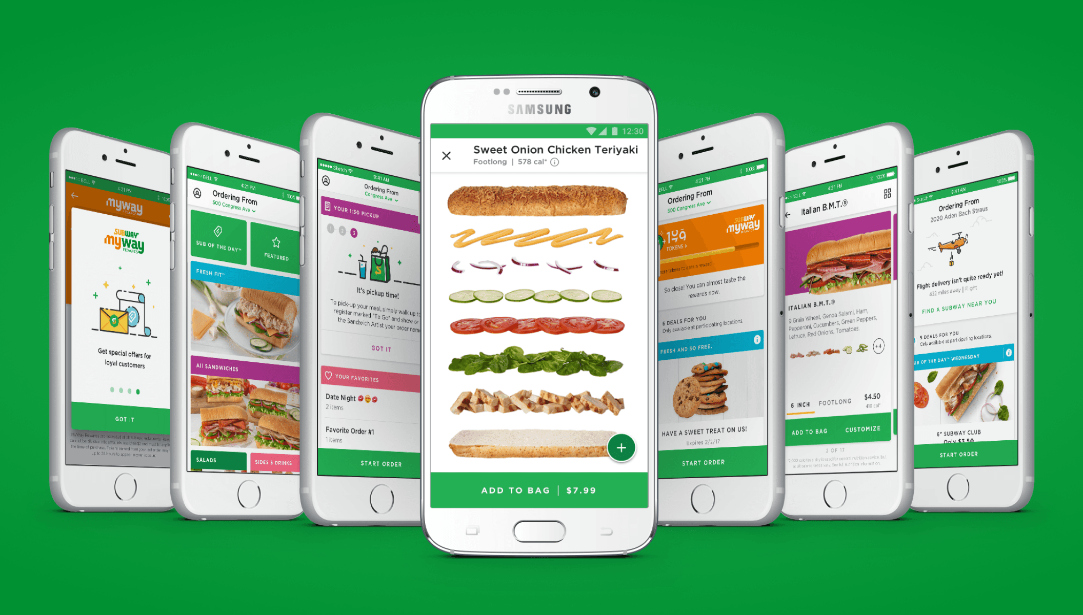
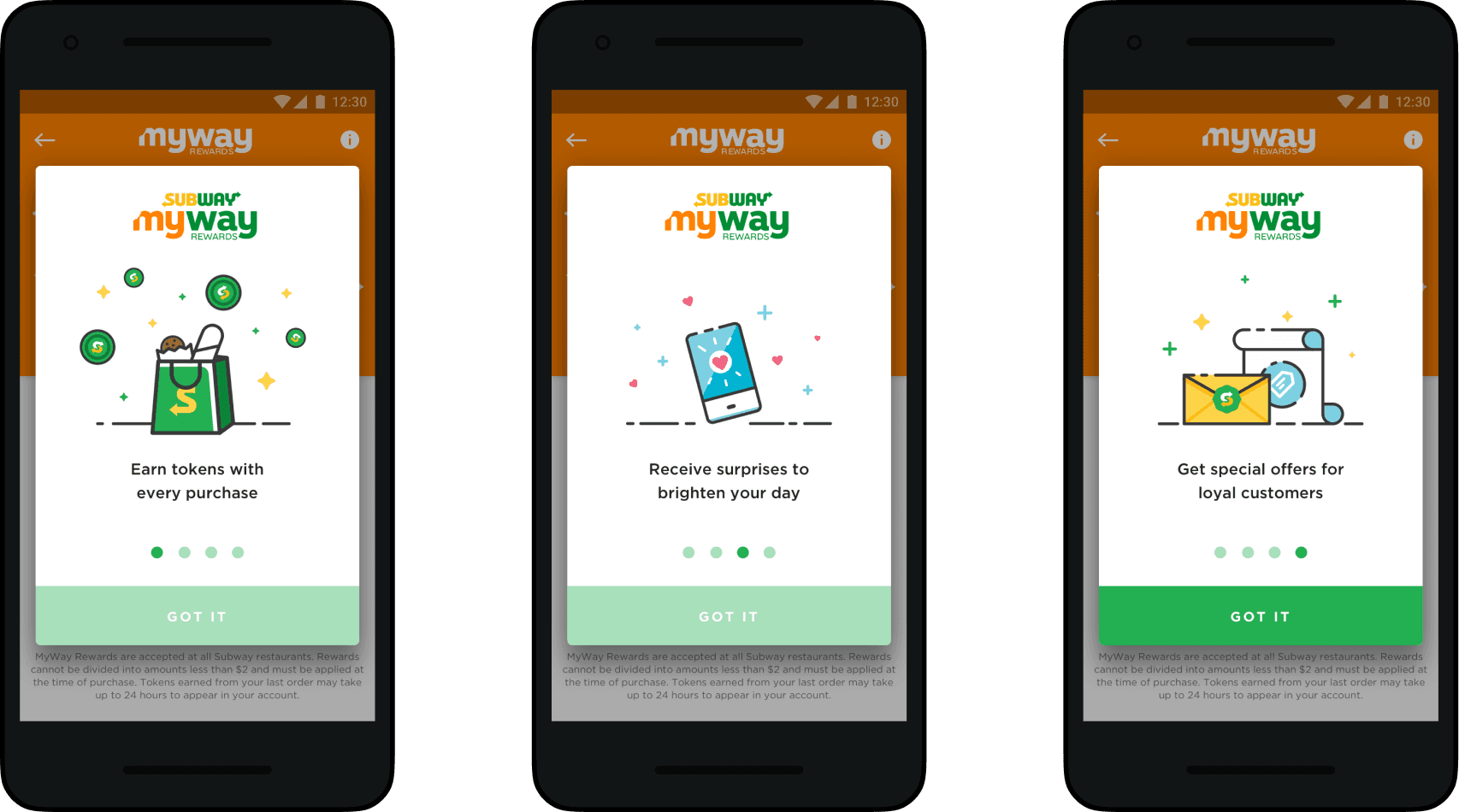
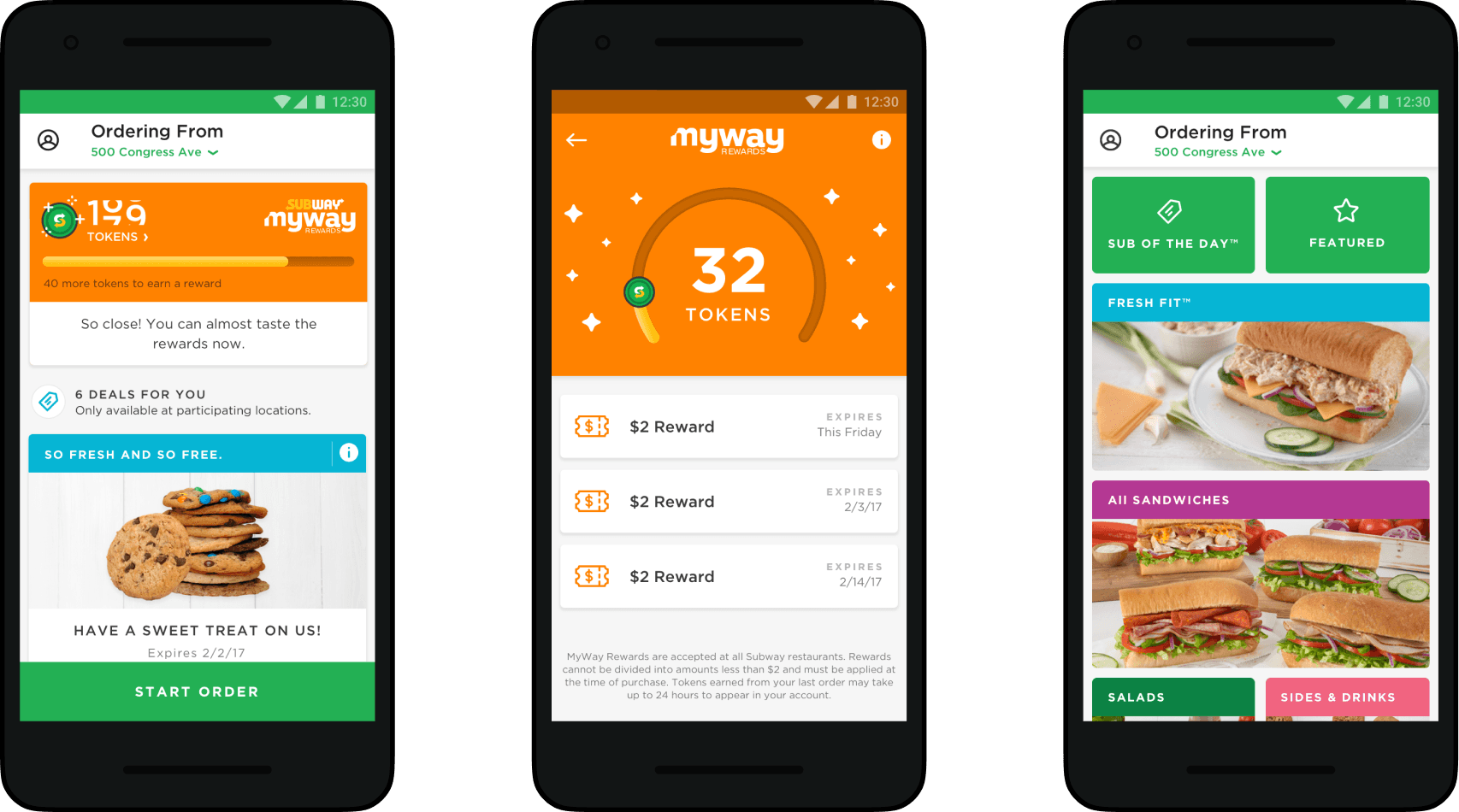
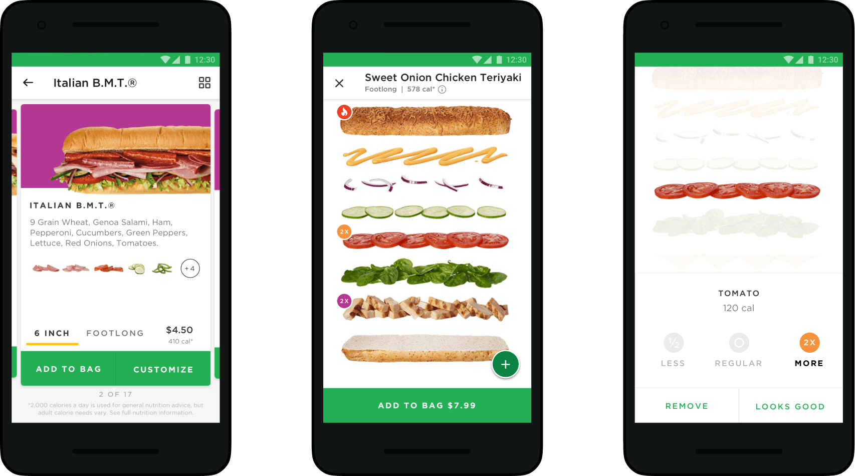
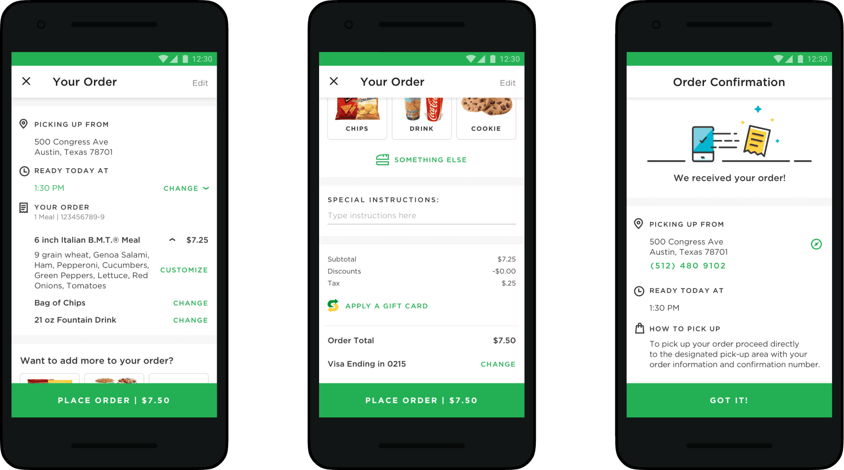
Ultimately we were left to piece together new and old Subway brands in order to deliver the product on time. Given all of the barriers we had to navigate, I believe we delivered a handsome product that fits gracefully in the Subway brand of digital products. More importantly, the team improved the overall user experience at every touch point along the way. A handful of select features below:
Results /
The new Subway app launched in Q3 of 2017. Some key success metrics that have been gathered thus far include:
23% increase in new signups
45% less cart abandoned
15k+ more daily active users
4.6 star ranking in App Store
MyWay Rewards Loyalty program launched nationally in Spring 2018. The program was received with high regard by Subway patrons and is still going strong with indications it will remain a key part of Subways digital products into the future.
